Interior Designing tips: 10 common mistakes to avoid
While it’s not rocket science, interior design does need a keen eye and a creative flair. Knowing right from wrong can transform a chaotic and cramped space into organized and tranquil. To create a sense of balance and order, a few small tweaks can do wonders for your space. Read on to know what is right and wrong, what counts as a design faux pas and how to fix it!
1. Over-furnishing your home
Your room should not be a dumping ground for your furniture and accessories; it should create movement and flow. Plan your space in such a way that is aesthetically appealing as well as functional. Over furnished rooms makes space looks cramped, try to move around the furniture to see what fits best.

2. Poor lighting
lightning is one if the key element in interior designing. It is the soul of your room. The right lighting creates the perfect ambiance. Make most of your natural light. Do not block natural light from poorly placed curtains and accessories. You can enhance the amount of natural light in your house by placing mirrors directly across the source of light so that it can reflect and bounce around the entire room. Also invest in good recessed, ambient, overhead lighting to elevate your space aesthetically.

3. Avoid too much matching in colors
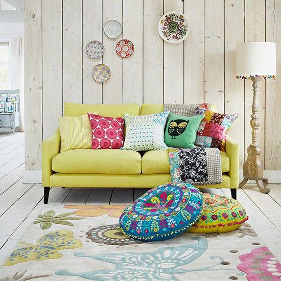
Mix and experiment with colors and patterns, to give a refreshing appeal to your space. If your table and chairs match, add a console made of rattan, a bright pouf or simply a painted cabinet. It’s the juxtaposition of different finishes and styles that give a room interest and style. If you want to stick to one color, you can try several shades of that color. It adds a wonderful effect to the overall décor.

4. Don’t back your furniture up against your wall
A common mistake novices make. You would want to push your modern Italian furniture design all together to create an intimate setting. This will create flow and will allow people to move around easily. You can push it all against the wall if you want an empty space in between for example for hosting a party and making the center a dance floor.

5. You don’t have a focal point
Your room should be planned in such a way that it has a focal point. Anyone entering the room should take notice of one thing. The object here should be large, impressive and bold; it should be able to make a style statement. A focal point defines a room and also gives an order to it, thus making it look balanced, thought out and organized.


